¶ CSS Selectors in Silex
The Selector Manager in Silex allows you to efficiently manage and apply complex CSS selectors within your project. It enhances the style management capabilities of the editor, making it easier to work with classes, IDs, tag names, and advanced CSS relationships like pseudo-classes and attribute selectors.
Technicly, this is a grapesjs plugin, pre-installed in silex, here is the source code of this plugin
¶ Accessing the Selector Manager
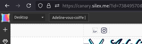
To open the Advanced Selector Manager, select any element in your project and navigate to the Styles panel. You will find an enhanced interface that provides better control over CSS selectors.
¶ Key Features
¶ 1. View All Applied Selectors
- When selecting an element, the Advanced Selector Manager lists all the CSS selectors that affect it.
- This includes direct styles, inherited styles, and styles applied via media queries.
¶ 2. Modify Selectors Efficiently
- Rename a class: Change the name of a CSS class applied to elements throughout the design.
- Add or remove selectors: Apply multiple selectors to a single element.
- Edit tag names: Convert an element from one tag type (
<div>,<section>,<article>, etc.) to another. - Manage attribute selectors: Add
[data-*]and other custom attributes for styling.
¶ 3. Work with Nested and Pseudo-Selectors
- Apply styles to elements based on their position in the hierarchy (e.g.,
div > .button). - Use pseudo-classes (
:hover,:focus,:nth-child(n)) to style interactions. - Define negation and combination rules (
:not(),:has(), etc.).
¶ 4. Apply Breakpoint-Specific Styles
- The plugin supports media queries (
@mediarules) to define styles at different screen sizes. - Easily see which styles are active at different breakpoints.
- Modify responsive styles directly from the selector interface.
¶ Getting started with the Selector Manager
¶ 1. Select an Element
Click on an element in the canvas to open the Advanced Selector Manager.
¶ 2. Add or Modify Selectors
- Click on the Selector Field to edit an existing selector or add a new one.
- Start typing a class name to select an existing class or create a new one.
- Use the dropdown menu to switch between ID selectors, tag selectors, and attribute selectors.
¶ 3. Organize and Rename Selectors
- Click the rename button (✏️) next to a class or ID to change its name across all elements.
- Drag and drop selectors to reorder priority if necessary.
¶ 4. Manage Pseudo-Classes and Advanced Selectors
- Click the “pseudo class” button to add pseudo-classes like
:hover,:focus, and:first-child. - Use the Advanced Mode to create nested selectors (
parent > childrelationships).
¶ 5. Adjust Styles at Different Breakpoints
- Switch between mobile, tablet, and desktop views to modify selectors at specific breakpoints.
- Use the Breakpoint Selector to see which styles are active at different screen sizes.
¶ Use the selector manager
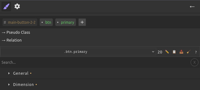
¶ 1. Main Selector (tags row at the top)
This row shows the parts of the selector that directly identify the element.
-
Tag name (e.g.
div,button)- You can add or remove it from the selector.
- This does not change the real HTML tag of the element, only whether the selector uses it.
-
ID (e.g.
#main-button-2-2)- The element still has its ID in the DOM.
- You can choose to include or exclude it in the selector.
-
Class (e.g.
.btn,.primary)- Adding/removing a class here also adds/removes it from the actual element in your page.
- Renaming a class updates it everywhere in the project.
¶ 2. Pseudo-Class selector
This control lets you style the element in a particular state, e.g.
➡ Changing or removing the pseudo-class here does not change the CSS. It only tells the editor which variant of the selector you are currently styling.
¶ 3. Related Selector and Operators
You can extend the selector with:
- Combinators (
>,+,~, space) - Another selector (classes, IDs, tags, etc.)
- Functional pseudo-classes that act like operators:
:not():has():is():where()
➡ Adding/removing parts here never changes your DOM or CSS classes.
It only lets you target different situations (e.g. .parent > .child, .btn:not(.disabled)).
¶ Current Selector drop down
The Current Selector Display is the control panel at the bottom of the Selector Manager.
It shows which CSS selector you are currently editing and gives you a list of all the existing selectors for the current selection.
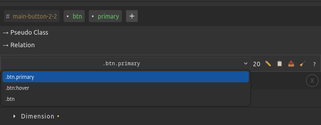
- Use the dropdown to switch between all selectors applied to the current element
- Example: selecting a button might show
.btn.btn.primarybutton:hover
- Choose one to edit its styles directly
¶ Toolbar Actions
| Icon | Action | Description |
|---|---|---|
| ✏️ | Edit Selector | Opens an input where you can directly rename or refine the selector (.item → .item.active, etc.) |
| 📋 | Copy Styles | Copies all CSS properties defined in this selector to the clipboard |
| 📥 | Paste Styles | Applies the last copied styles to the current selector |
| 🧹 | Clear Styles | Removes all styles from the selector but keeps the selector itself |
| ❓ | Help | Opens documentation about the selector manager |
¶ Best Practices
✔ Use classes instead of IDs for styling whenever possible to keep your design flexible.
✔ Use :not() and :has() carefully to avoid performance issues with complex selectors.
¶ Valid Selectors Guide
This document explains what CSS selectors are valid and suggested by the GrapesJS Advanced Selector plugin.
¶ Overview
The Advanced Selector plugin supports standard CSS selectors with intelligent validation and suggestions. It only allows valid CSS selector patterns and provides contextual suggestions based on your component structure.
¶ Simple Selector Types
¶ 1. Tag Selectors
Format: tagname
Examples: div, p, span, button
- Valid: Standard HTML tags (div, p, span, button, etc.)
- Valid: Custom elements with hyphens (e.g.,
my-component) - Suggested: Based on actual tags in your document
- Case: Lowercase only
¶ 2. Class Selectors
Format: .classname
Examples: .my-class, .btn-primary, .navigation
- Valid: Must start with letter, underscore, or hyphen
- Valid: Can contain letters, numbers, hyphens, underscores
- Suggested: Existing classes from your stylesheet and components
- Case: Case-sensitive
¶ 3. ID Selectors
Format: #idname
Examples: #header, #main-content, #user-123
- Valid: Must start with letter, underscore, or hyphen
- Valid: Can contain letters, numbers, hyphens, underscores
- Suggested: Existing IDs from your components
- Case: Case-sensitive
- Note: IDs should be unique in the document
¶ 4. Attribute Selectors
Format: [attribute] or [attribute="value"]
¶ Standard Attributes (Always Valid)
The following HTML attributes are always accepted:
[id],[class],[style][name],[type],[value],[placeholder][href],[src],[alt],[title][width],[height],[disabled],[checked][selected],[hidden],[readonly],[multiple][required],[min],[max],[step],[pattern][autocomplete],[autofocus],[spellcheck][contenteditable],[dir],[lang],[tabindex][accesskey],[role]
¶ Data Attributes (Custom Attributes)
Format: [data-*]
Examples: [data-test], [data-user-id], [data-toggle]
- Valid: Must start with
data-followed by at least one character - Valid: Can contain letters, numbers, hyphens, underscores
- Case: Case-sensitive
¶ Attribute Operators
You can use CSS attribute operators:
[attr="value"]- Exact match[attr~="value"]- Word match (space-separated)[attr|="value"]- Language code match (hyphen-separated)[attr^="value"]- Starts with[attr$="value"]- Ends with[attr*="value"]- Contains substring
¶ 5. Universal Selector
Format: *
Description: Matches all elements
¶ Invalid Selectors
The following patterns are NOT accepted:
¶ Custom Attributes (Non-data)
[customattr]- ❌ Not allowed[my-attribute]- ❌ Not allowed[testprop]- ❌ Not allowed
Why: Custom attributes should use the data-* prefix for valid HTML.
¶ Invalid Characters
- Selectors starting with numbers:
1class,#2id - Selectors with spaces:
.my class,#my id - Invalid CSS characters in names
¶ Suggestions System
¶ Context-Aware Suggestions
The plugin provides intelligent suggestions based on:
- Current Selection: Attributes and classes from selected components
- Document Context: Existing selectors in your stylesheet
- Component Hierarchy: Parent/child relationships for complex selectors
¶ Suggestion Sources
- Tag Names: From components in your document
- Classes: From existing CSS rules and component classes
- Attributes: From component attributes (excluding
id- use#idinstead) - Data Attributes: Custom data attributes from components
¶ Excluded from Suggestions
- ID attributes: Use
#idsyntax instead of[id="..."] - Duplicate selectors: Already present in current selector
- Private/system classes: Internal GrapesJS classes
¶ Complex Selectors
¶ Combinators
- Descendant:
div p(space) - Child:
div > p - Adjacent Sibling:
div + p - General Sibling:
div ~ p
¶ Pseudo-classes
:hover,:focus,:active:first-child,:last-child,:nth-child():not(),:is(),:where()
¶ Pseudo-elements
::before,::after::first-line,::first-letter
¶ Examples
¶ Valid Selector Patterns
/* Simple selectors */
div
.my-class
#header
[data-toggle]
[type="button"]
*

/* Complex selectors */
div.container
#header .navigation
.btn[disabled]
[data-role="button"]:hover
.parent > .child
div + p
.container [data-test="value"]

/* Pseudo-classes and elements */
.button:hover
.input:focus
.list-item:first-child
.content::before
¶ Invalid Selector Patterns
/* These will be rejected */
[customattr]          /* Use [data-customattr] instead */
[testprop="value"]    /* Use [data-testprop="value"] instead */
.2invalid             /* Cannot start with number */
#my id                /* No spaces allowed */
[data-]               /* Incomplete data attribute */
¶ Best Practices
- Use data attributes for custom properties:
[data-component="header"] - Prefer semantic names:
.navigationover.nav1 - Follow CSS naming conventions: lowercase with hyphens
- Use ID selectors for unique elements:
#headernot[id="header"] - Combine selectors for specificity:
.button[data-variant="primary"]
¶ Validation Behavior
- Real-time validation: Invalid selectors show error immediately
- Auto-completion: Incomplete selectors are automatically completed when valid
- Suggestion filtering: Only valid, contextual suggestions are shown
- Type-ahead: Start typing to filter suggestions
¶ Troubleshooting
¶ “My styles are not applying”
- Ensure that another selector isn’t overriding your styles (check the selector priority in the Style Manager).
- Check if the style is applied inside a media query that isn't currently active.
¶ “I renamed a class, but some elements still use the old one”
- Some elements might have inline styles or protected classes. Check if they are editable.
¶ “A pseudo-class (:hover, :focus) isn't working”
- Some pseudo-classes may not be visible in the editor. Try previewing your page to test interactions.
¶ Why do I see ⚠ Current selector does not match the selected components?
This warning means that the selector you are editing does not currently apply to the element you have selected on the canvas. The editor tries to check if the selected component matches the rule you are styling. If it doesn’t, the warning is displayed.
This does not mean your selector is invalid or that the styles won’t work. It only indicates that, in the current context, the selected element is not matched by the selector. When the selector applies to elements in your final page (for example, because of different attributes, states, or structure), the styles will be applied normally.
Tip: You can usually ignore this message if you know your selector is valid for your intended use. It’s primarily a reminder that the currently selected component is not affected by it inside the editor preview.